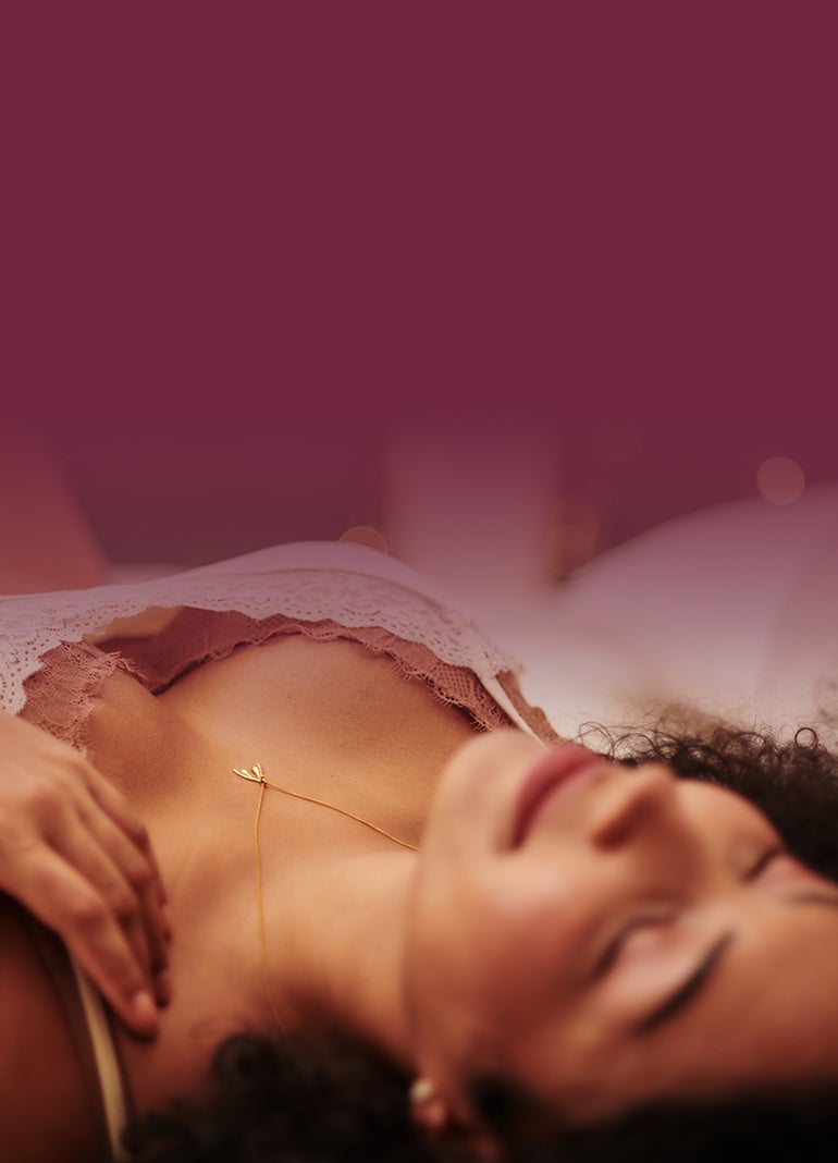
Breaker Banner
Recommended Image File Size: 80 KB – 300 KB. Max File Size: 1 - 1.5 Mb. Please use sparingly!
Mobile image size is needed. Color & Backgorund color inputs needed. Breaker Banner on PDP is not full-width
Lorem Ipsum Dolor. Lorem Ipsum Dolor.
Category Banner

Catalog Products List

Grouped Review Slider
Heading Image: 1920x330px. Desktop & Mobile Image: 533x533, JPEG


Hero Banner
Desktop image: 1920x600, Mobile image: 770x1068, JPEG.
Disruptor: 200x200, under 500kb, png
3rd Layer images: Desktop 960x600, Mobile: 770x534

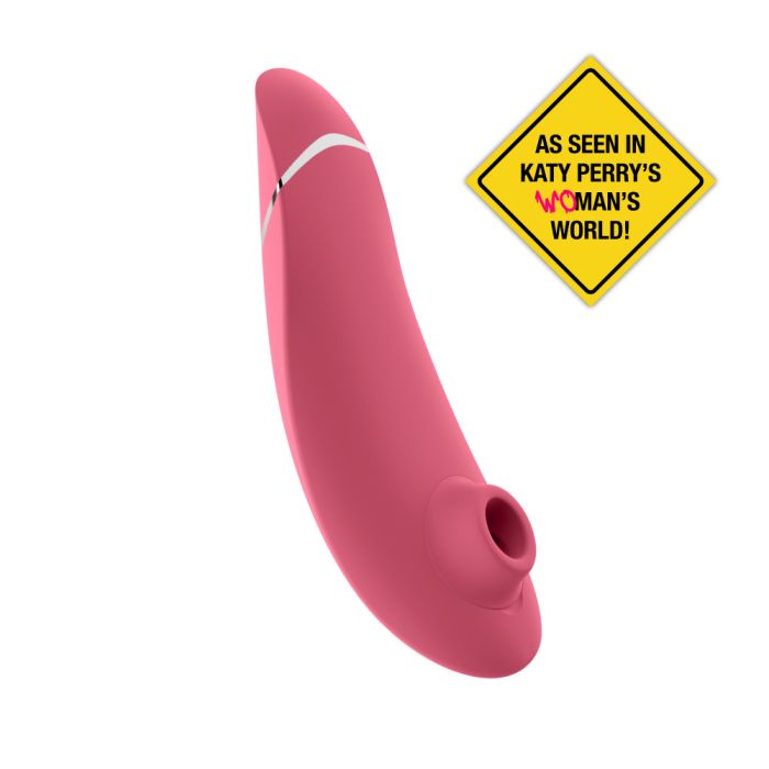
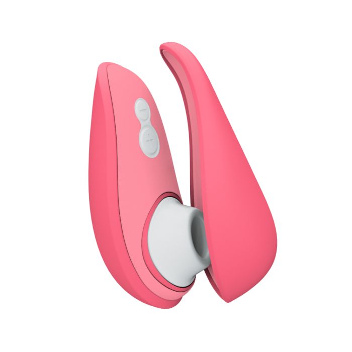
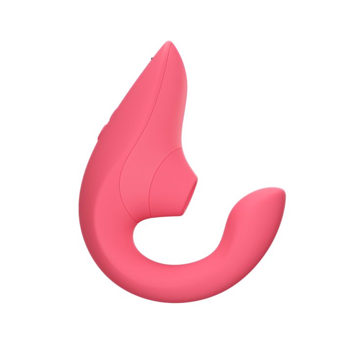
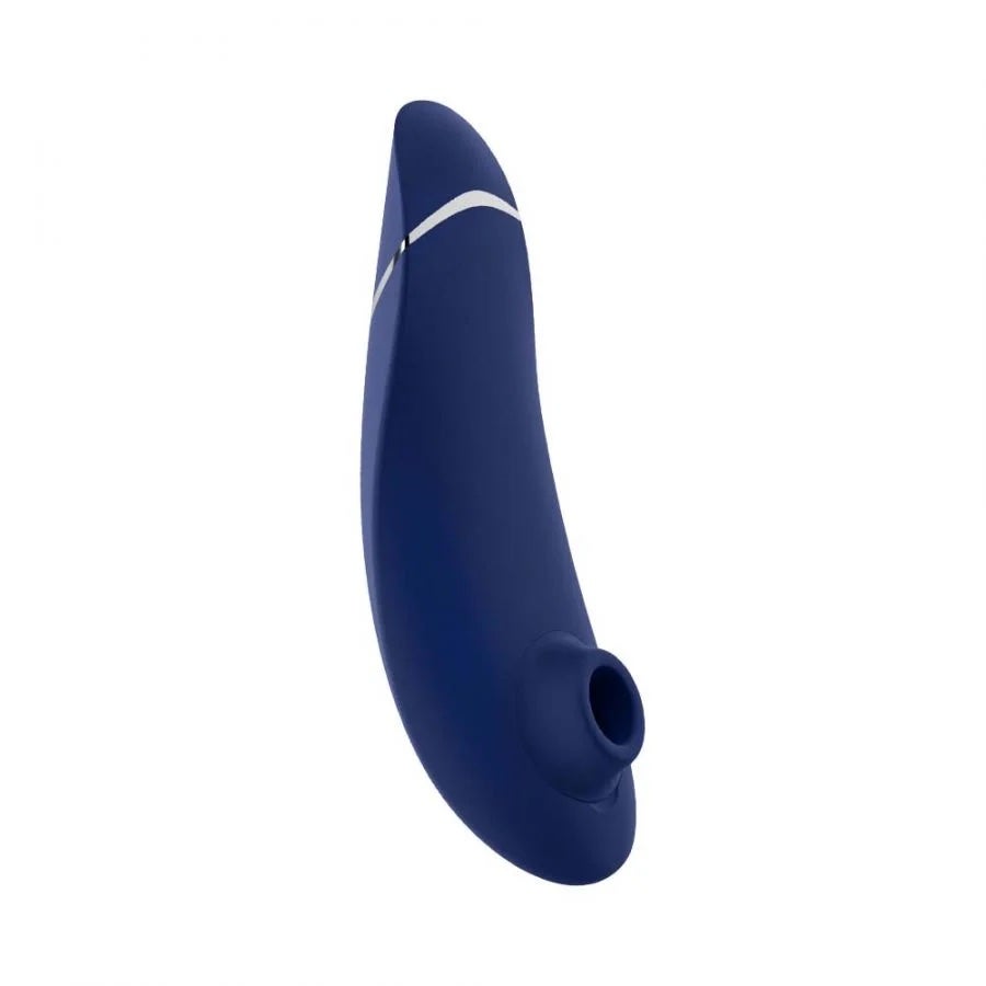
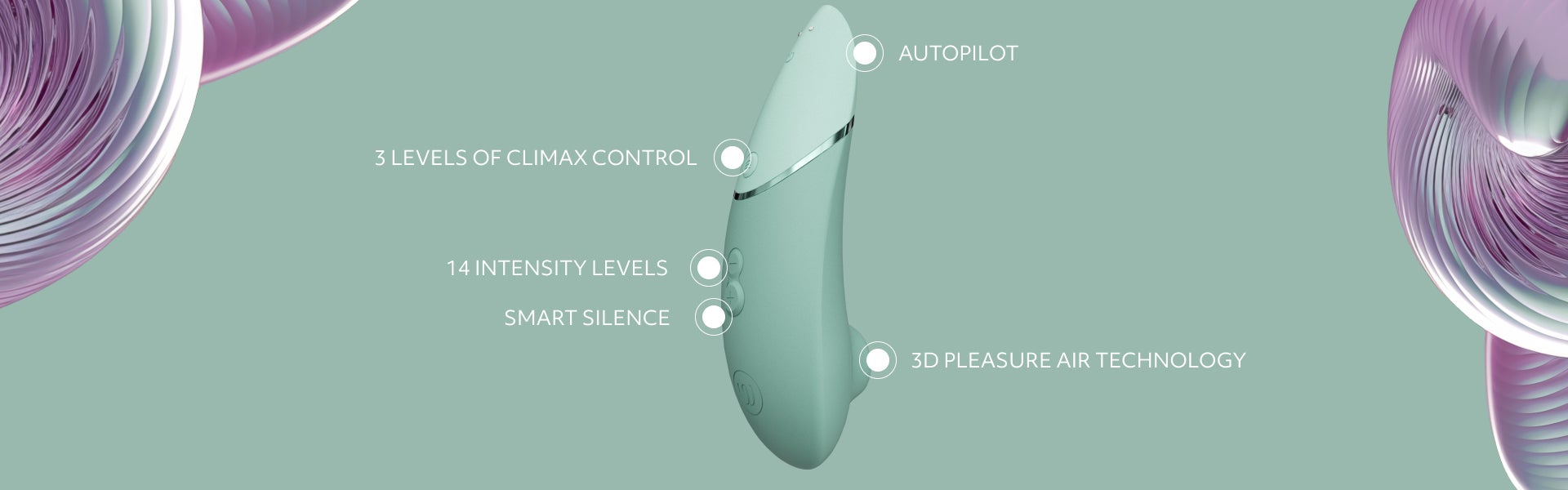
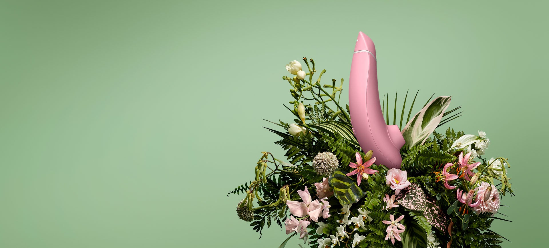
Womanizer Next
The Original in Orgasm Technology
3D Pleasure Air Stimulation
Images Row
Desktop: 253x253, Mobile: 369x369 (???), JPEG
Support is needed for: Image Title, Image Text
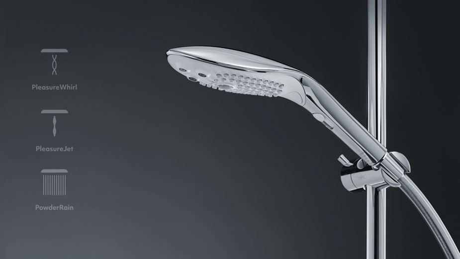
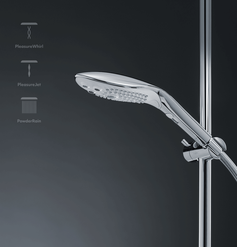
Universal fit that is compatible with any standard handheld shower head connection. For fixed shower heads, an adapter or hose connection kit makes install just as easy. Fixed Shower Head Install (adapter & hose sold separately):This is a heading. This is a heading.
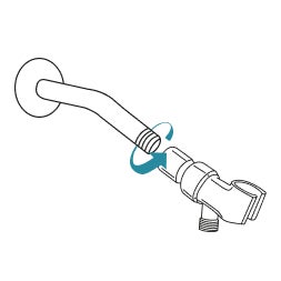
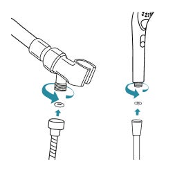
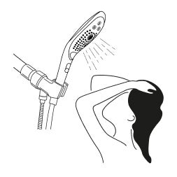
Image Tiles
Desktop & Mobile: 72x72, JPEG
Text #1 should not be required. Color input fields are needed. Widget should support 6 images, Headings, and Text. Only supports 4 currently.
This is a title. This is a title.


Interactive List
Title: Making Toys Smarter

Title 1

Title 2

Title 3

Title 4: Climax Control
Newsletter
Product Compare
Heading
 Header #1Subheader #1Header 2Subheader 2Header #3Subheader #3
Intensity We-Connect™ Row Row Row Modes Row Row Row Waterproof
Row of Cards
Desktop & Mobile: 400x400px, JPEG
This is a Header. This is a Header.
This is a Header. This is a Header.
Shop by category

Simple Text Image
Desktop 1920x640, Mobile: N/A, JPEG
Mobile Image support needed.
Text Alignment, Header Type, CTA title, CTA link, CTA target needed.
This is a heading. This is a heading.
Text & Image
Recommended Image File Size: 80 KB – 300 KB. Max File Size: 1 - 1.5 Mb. Please use sparingly!
Text & Image: Right
Text & Image: Left
Text & Image w/o Button
Text & Image: Image Center Top
Text & Image: Image Center Bottom
Text & Image: (TEXT ONLY)
Text Image Tiles
Text and Background Image
Recommended Image File Size: 80 KB – 300 KB. Max File Size: 1 - 1.5 Mb. Please use sparingly!
Text
Default Styles
Header 1
Header 2
Header 3
Header 4
Header 5
Header 6
Lorem ipsum dolor sit amet, consectetur adipiscing elit, sed do eiusmod tempor incididunt ut labore et dolore magna aliqua. Ut enim ad minim veniam, quis nostrud exercitation ullamco laboris nisi ut aliquip ex ea commodo consequat.
- Womanizer - Image Size Document
- Design Key
- Ant Design Components Overview
- Ordered List item
- Ordered List item
- Ordered List item
- ul list item
- ul list item
- ul list item
Bootstrap
Aligned Text
Left-aligned text using the text-start class.
Right-aligned text text-end class.
Center-aligned text text-center class.
No wrap text text-nowrap class.
Text Transform
text-lowercase
text-uppercase
text-capitalize
Font Size
.fs-1 text
.fs-2 text
.fs-3 text
.fs-4 text
.fs-5 text
.fs-6 text
Line height
lh-1 This is a long paragraph written to show how the line-height of an element is affected by our utilities. Classes are applied to the element itself or sometimes the parent element. These classes can be customized as needed with our utility API.
lh-sm This is a long paragraph written to show how the line-height of an element is affected by our utilities. Classes are applied to the element itself or sometimes the parent element. These classes can be customized as needed with our utility API.
lh-base This is a long paragraph written to show how the line-height of an element is affected by our utilities. Classes are applied to the element itself or sometimes the parent element. These classes can be customized as needed with our utility API.
lh-1g This is a long paragraph written to show how the line-height of an element is affected by our utilities. Classes are applied to the element itself or sometimes the parent element. These classes can be customized as needed with our utility API.
Font weight and italics
fw-bold
fw-bolder Bolder weight text (relative to the parent element).
fw-semibold Semibold weight text.
fw-normal Normal weight text.
fw-light Light weight text.
fw-lighter Lighter weight text (relative to the parent element).
fst-italic Italic text.
fst-normal Text with normal font style
Display Headings
Display headings are used to stand out more than normal headings with a larger font-size and lighter font-weight. There are six classes to choose from: .display-1 to .display-6
display-1
display-2
display-3
display-4
display-5
display-6
Contextual Colors
Use the contextual classes to provide "meaning through colors":
This text is text-muted.
This text is text-primary.
This text indicates text-success.
This text is text-info.
This text is text-warning.
This text is text-danger.
This text is text-secondary.
This text is text-dark.
This test is text-body (often black).
This text is text-light on background bg-warning (on bg-warning).
This text is text-white on background bg-warning (on bg-warning).
Contextual Backgrounds
Use the contextual background classes to provide "meaning through colors".
Note that you can also add a .text-* class if you want a different text color:
This text uses the bg-primary text-white classes.
This text uses the bg-success text-white classes.
This text uses the bg-info text-white classes.
This text uses the bg-warning text-white classes.
This text uses the bg-danger text-white classes.
This text uses the bg-secondary text-white classes.
This text uses the bg-dark text-white classes.
This text uses the bg-light text-dark classes.
This text use bg-body text-dark
This text use bg-white text-dark
This text use bg-transparent text-dark
Spacing Utilities
Set the spacing of an element with the {property}{sides}-{breakpoint}-{size} classes.
Omit breakpoint if you want the padding or margin to work on all screen sizes.
Bootstrap 5 has a wide range of responsive margin and padding utility classes.
They work for all breakpoints: xs (<=576px), sm (>=576px), md (>=768px), lg (>=992px), xl (>=1200px) or xxl (>=1400px)):
The classes are used in the format: {property}{sides}-{size} for xs and {property}{sides}-{breakpoint}-{size} for sm, md, lg, xl and xxl.
Where property is one of: m - sets margin p - sets padding
Where sides is one of: t - sets margin-top or padding-top b - sets margin-bottom or padding-bottom s - sets margin-left or padding-left e - sets margin-right or padding-right x - sets both padding-left and padding-right or margin-left and margin-right y - sets both padding-top and padding-bottom or margin-top and margin-bottom
blank - sets a margin or padding on all 4 sides of the element
Where size is one of: 0 - sets margin or padding to 0 1 - sets margin or padding to .25rem 2 - sets margin or padding to .5rem 3 - sets margin or padding to 1rem 4 - sets margin or padding to 1.5rem 5 - sets margin or padding to 3rem auto - sets margin to auto
How It Works
Note: To add margin to the left side, use the class ms-* (margin start) instead of ml-* (margin left).
To add margin on the right, use the class me-* (margin end) instead of mr-* (margin right).
Below is an example using classes for the right margin with a visual representation of their sizes. The same sizes apply to all directions (left, right, top, bottom) and for both margins and padding.
| Class name | Size | Visual representation |
|---|---|---|
.me-1 | 0.25rem | |
.me-2 | 0.5rem | |
.me-3 | 1rem | |
.me-4 | 1.5rem | |
.me-5 | 3rem |